Dark theme was introduced with IOS 13 in September 2019 followed by Android 10(Q) in May 2020 after months of testing both operating systems introduced dark modes to make their user experience even better. Dark themes are one of the most demanded features in recent years. Both Apple and Google have made dark themes an integral part of their user interfaces. Reduce the brightness of the dark theme to ensure safety in dark environments and minimise eye strain.
Here are five things to keep in mind while using dark themes for design development purposes.
1. Avoid Pure Black
Dark themes don’t have to be all white text on an all black background. In actual fact, that high contrast can be painful to the eyes of the users.
It is secure to use a dark grey or shades of dark grey than true black (#000000) as the primary surface colour of your components. Dark grey or its shades on the surface reduces asthenopia. Light text on a dark grey surface has less disparity than light text on a black surface. A dark grey or shades of dark grey on the surface can show a wider range of colours, heights, and depths because shades of grey are more visible.
Material Design advocates using of #121212 as a dark theme colour
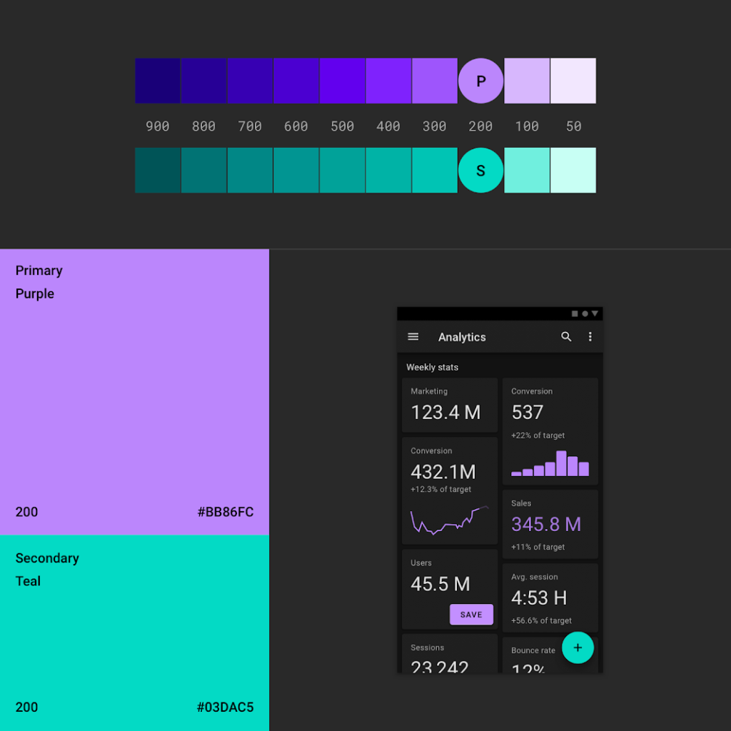
2. Do not use Drenched colours in Dark Themes
Drenched or Saturated colours that look great on light surfaces visually vibrate and become difficult to read on dark surfaces. Desaturate primary colours to create sufficient contrast with dark surfaces.
Light tones (colours in the 200-50 range) make it easier to read on dark themed surfaces. The brighter variant doesn’t make the interface less expressive, but it does help maintain good contrast without straining the user’s eyes.
3. Use “Hue” Colours for Text
The hue colour is the colour displayed on the “on” component and key surfaces. These are typically used for text.
The default valid colour for the dark theme is pure white (#FFFFFF). However, #FFFFFF is a light colour that visually “vibrates” against a dark background. This is why Google Material Design recommends using a slightly darker white.
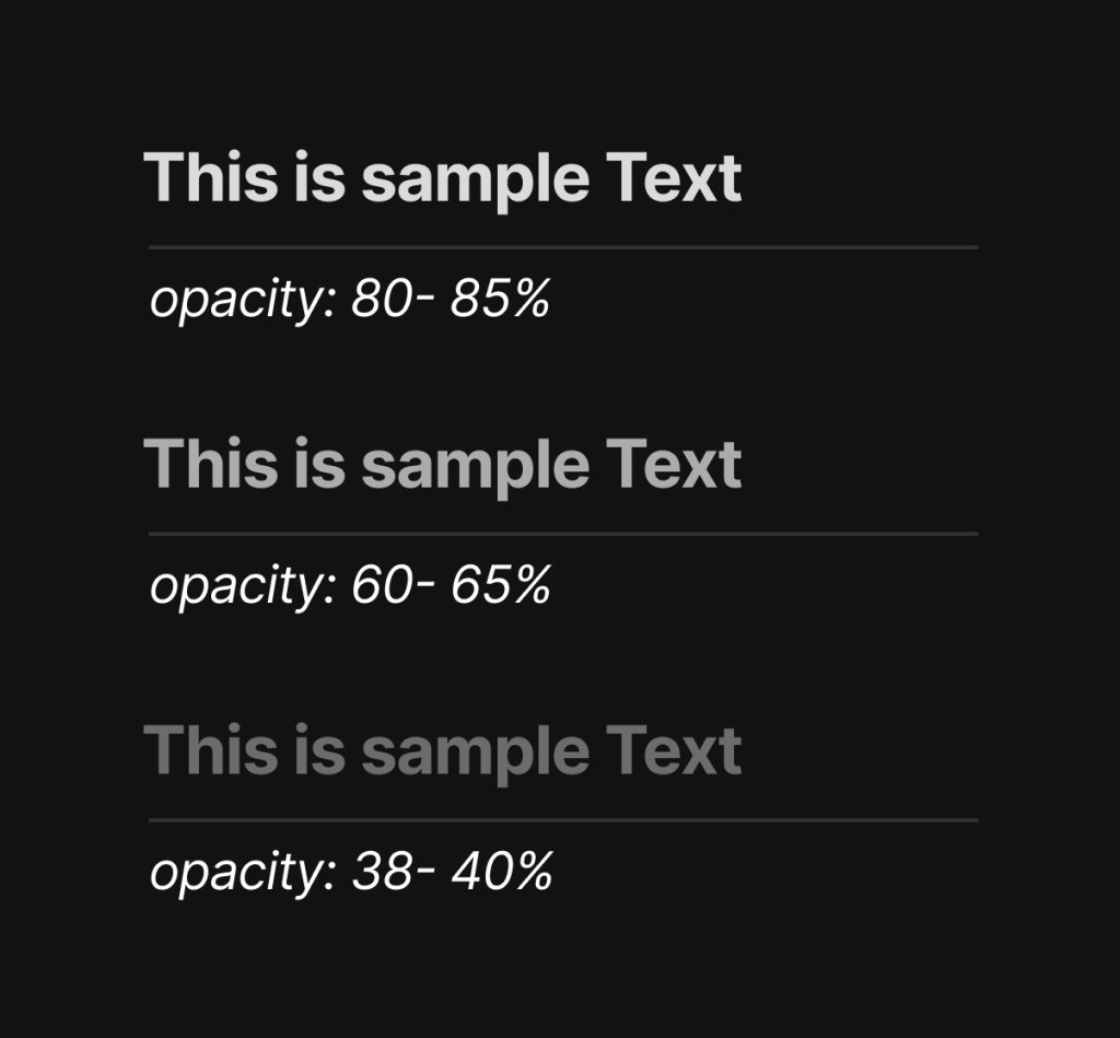
The highlighted text should have an opacity of 80-85%.
Medium emphasis text is applied at 60-65%.
Disabled text uses 38-40% opacity.
Quick Tip: Light text on a dark background will appear thicker than dark text on a light background. For this reason, it is recommended to use lighter font weights in dark mode.
4. Consider the Psychological aspect of Your Design
If you’re designing a dark theme for an existing app, you’ll want dark mode to convey the same range of emotions. But it won’t look the same as it would look on the light theme background. Colours appear extraordinary relying on the background.
This means that dark themes cannot convey the same thing as light themes. Therefore, dark and light themes always give rise to different emotions. Much better to use this for your product’s identity instead of trying to fix it. Dark mode does not (always) need to be derived from an existing light theme.
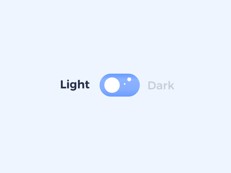
5. Allow Users to Switch from Normal mode to Dark mode
Sometimes it is alluring to let the system decide when to turn the dark theme on or off. However, this design decision can degrade the UX. This allows you to take control from the user and let the system decide. For this reason, it is better not to use the dark theme auto-activation. Allows the user to turn the dark theme on (or off) using her UI control. Users should be able to manually select the mode based on their needs. A mode switcher must be placed and designed.
Summary
There are many other points that need to be taken into consideration apart from the five points mentioned above like the communication of the depth in darker backgrounds, testing your design in both light and dark themes and many others. Using dark themes in application design is to be used sensibly and more research and analysis is required to make your designs stand out loud. Once the design process has started it is a really difficult job to turn back. Designers should be aware to consider all the aspects before using it for any of the projects.
